This branding project is the development of a conceptual children’s museum. This bright and vivacious product focuses on creating an exciting environment for its young visitors and the ease of travel through the museum. In addition to branding, the project involves basic building design and environmental elements.

I wanted the logo to convey the brand's values of interaction and critical thinking. My initial logo iterations centered around the ideas of basic shapes, thoughts, and interactions. I asked a few children what appealed to them. They all seemed to shy away from the more complicated designs.
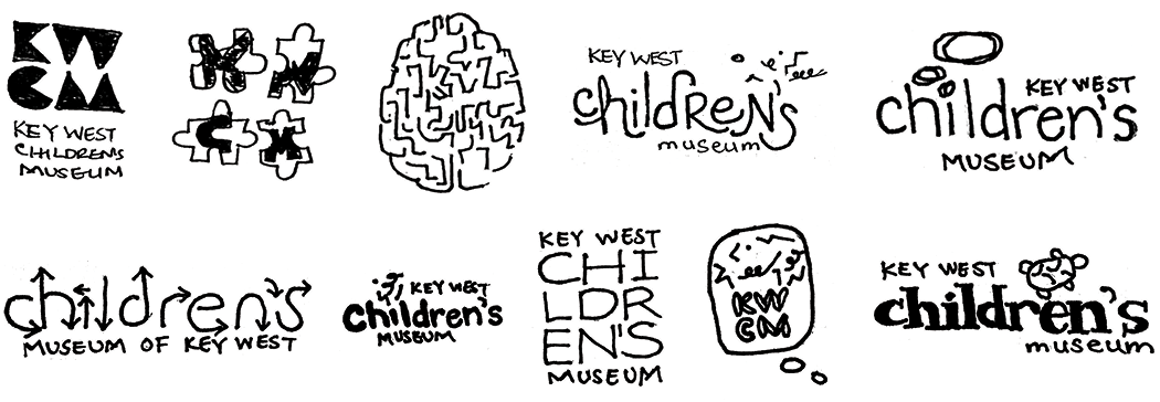
The final design ended up being a combination of a few ideas. The thought bubble represents the critical thinking focus of the museum. The arrows point to the interaction provided through many hands-on exhibits.

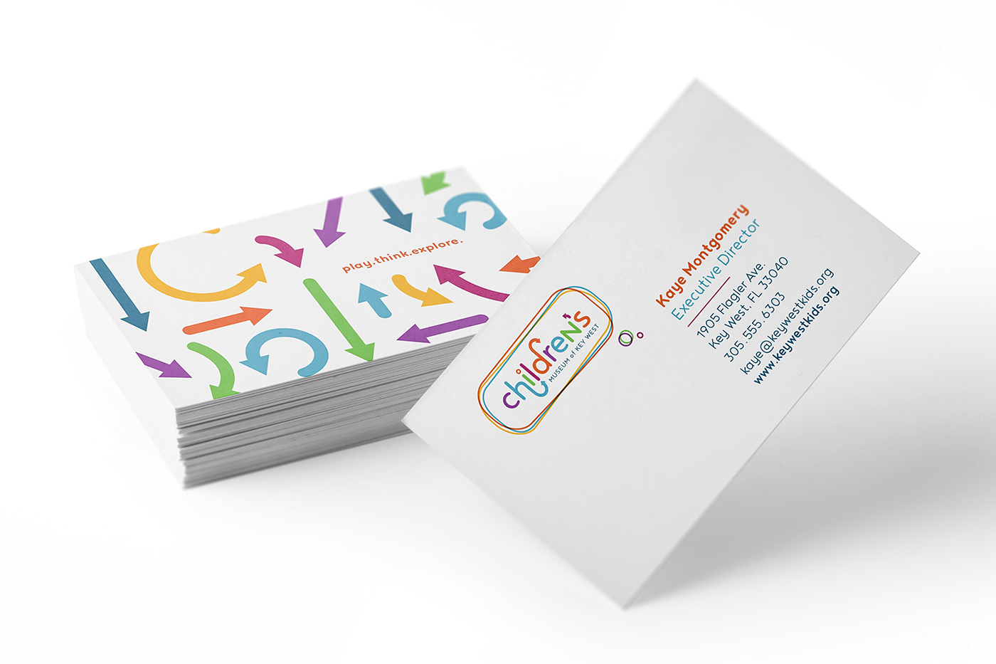
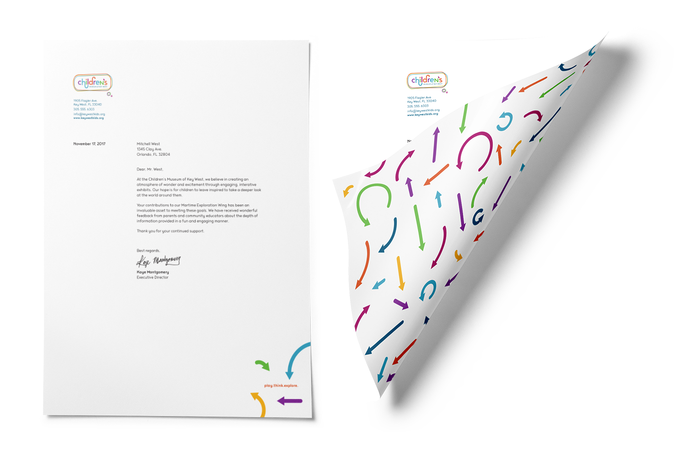
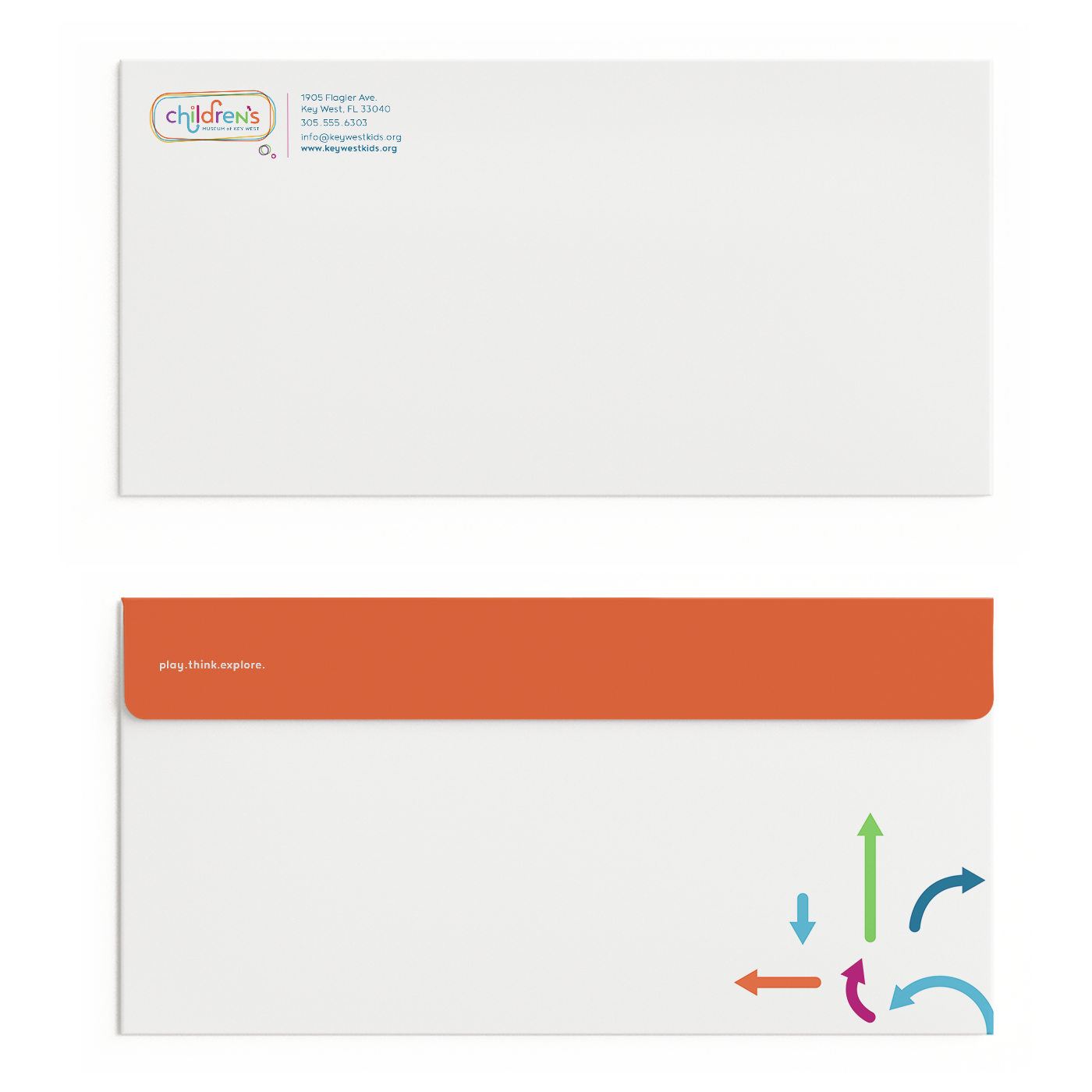
After working through the logo, I found the use of arrows to be very effective in conveying the message of interaction as well as direction. I decided to make this element the primary graphic on the remaining materials.
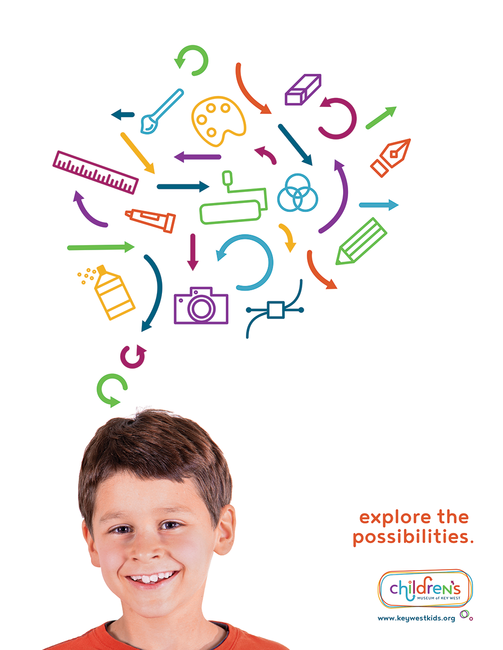
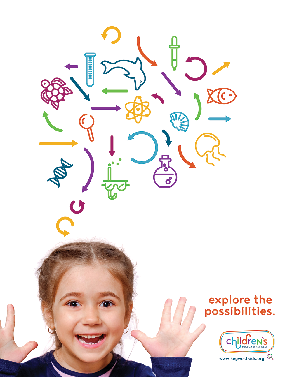
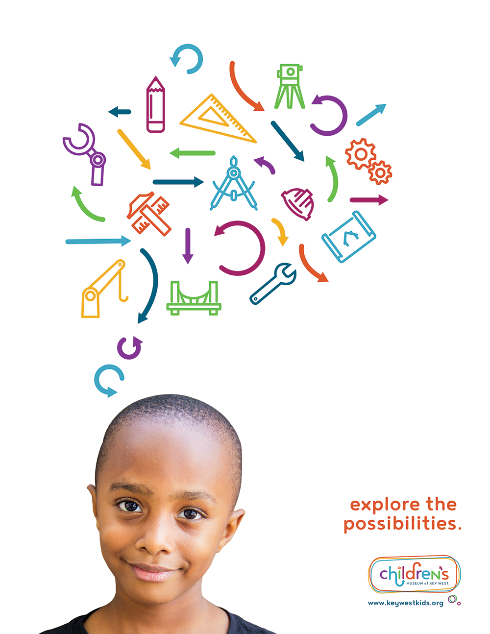
I wanted to highlight education outside of the classroom and the benefit of piquing a child’s interest in certain careers. For the advertisements, I created a series of icons centered around specific careers. The message to parents is, let your children explore the possibilities of the future.
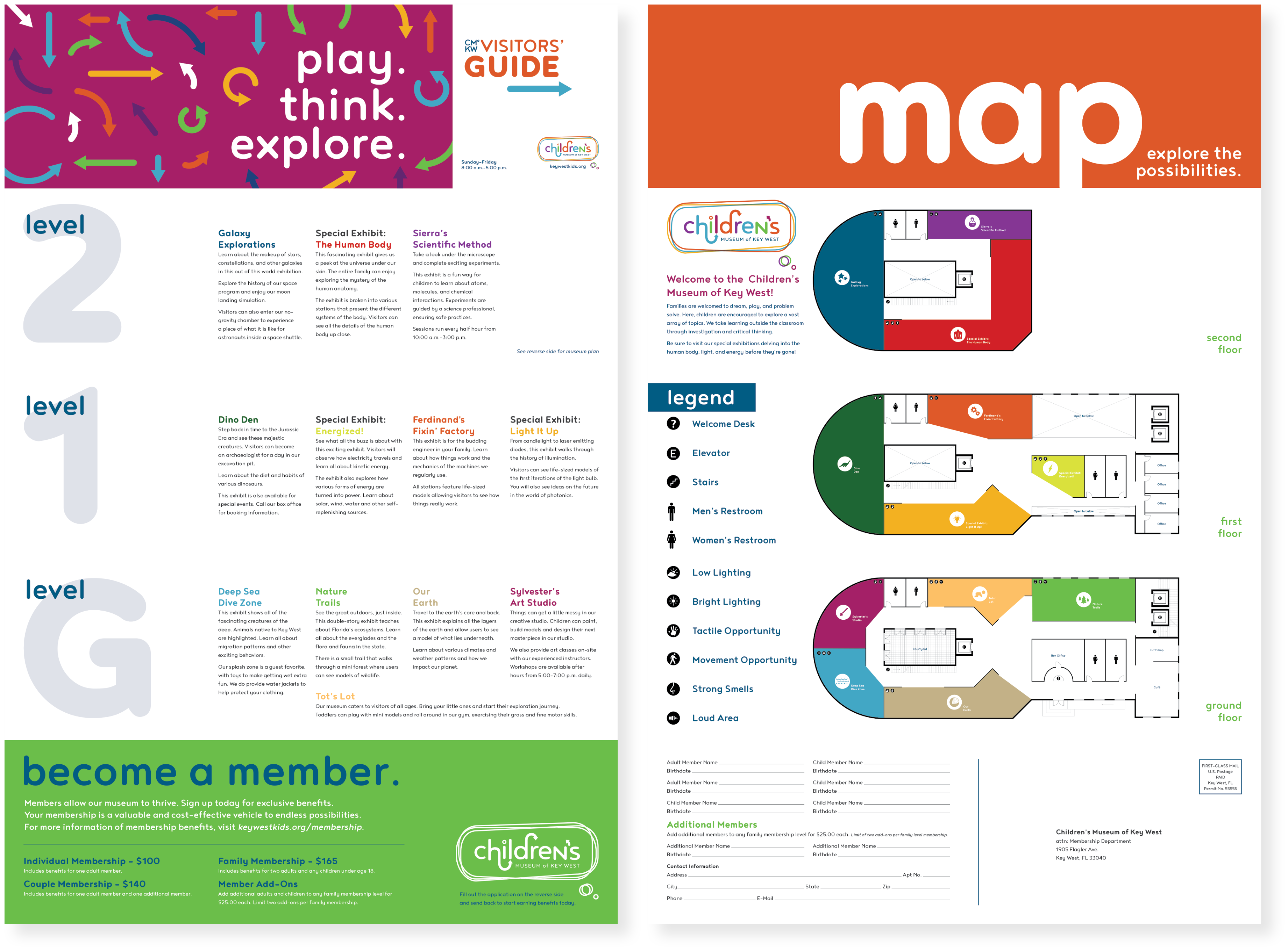
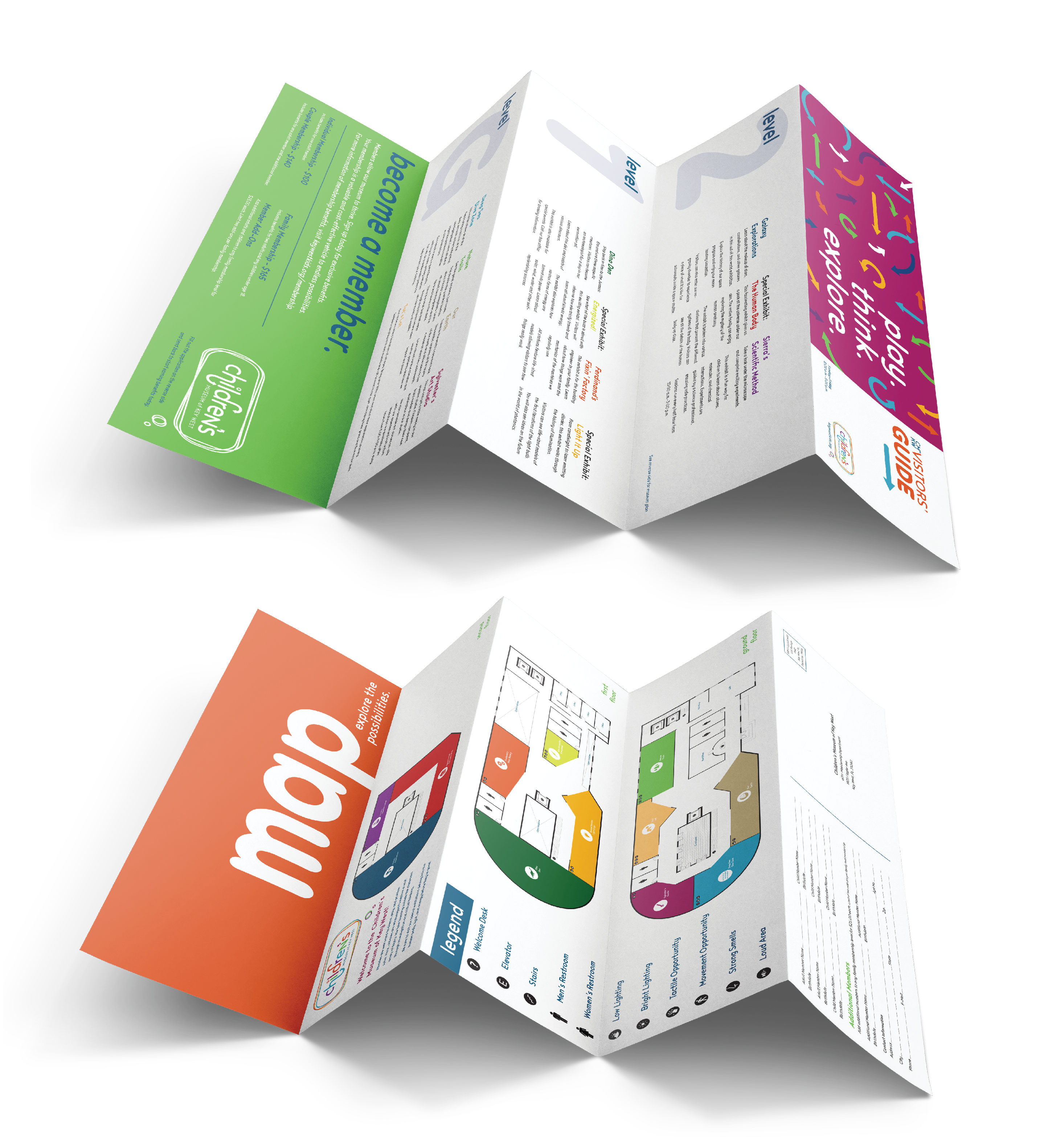
This brochure design focused on providing a convenient guide through the museum. I made the colors bright with iconography so children could begin to find their way through as well. The bottom of the card features a membership ad with a form on the back. This portion can be torn off and mailed back to the museum. I created the plans in AutoCAD and added the color coding and type in Illustrator.
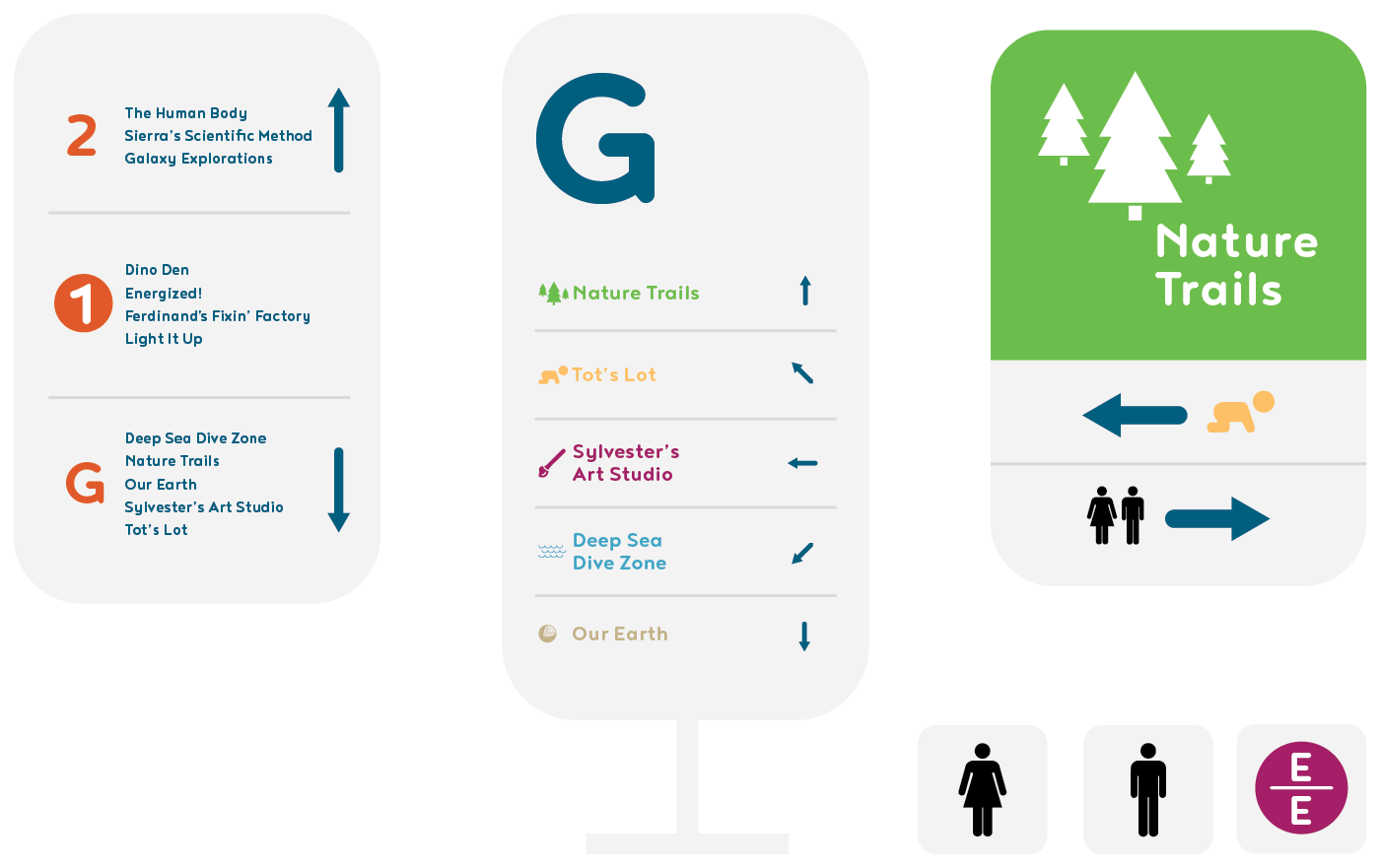
To complement the visitors’ guide, I designed a few signage pieces that allow users to flow more easily through the space. The iconography matches the symbols on the maps allowing children to be involved in the navigation process.
