Cacao is a conceptual Cuban restaurant brand development that focuses on creating an eclectic and authentic Cuban dining experience. This project was developed through the AIGA Mentorship Program. It weaves through research, logo development, color studies, and collateral creation to explore various points of user interaction, including a pop-up display for the program’s SPOT Showcase.
See the Site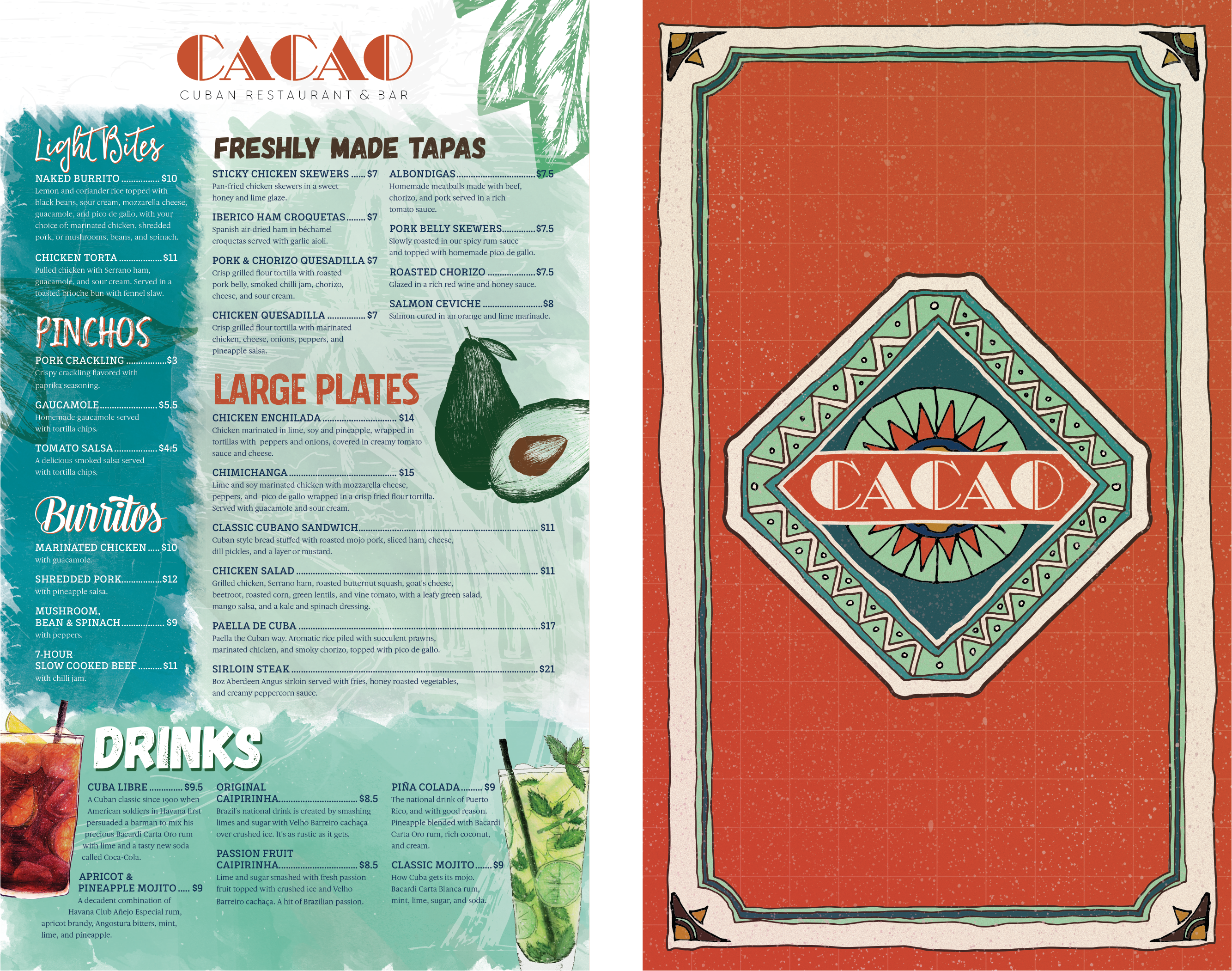
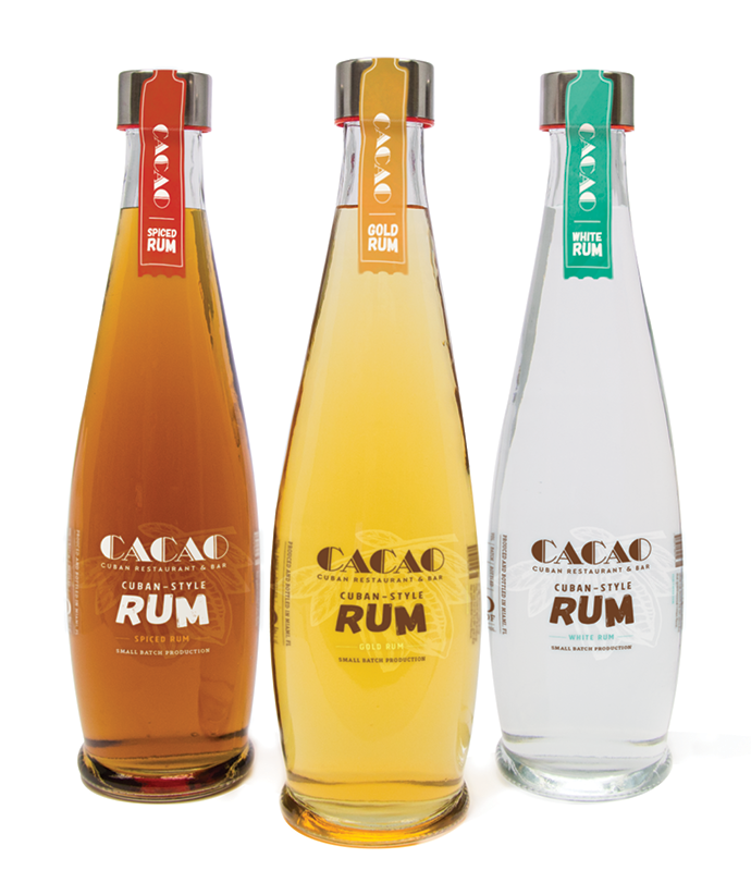
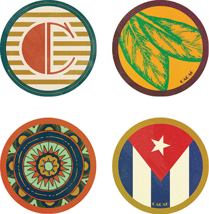
I wanted to create a brand that felt like it was taken out of the Cuban past, so my logo explorations focused on vintage typographic styles. Inspiration was pulled from travel posters, retail signage, cigar and rum labels, and Cuban art.
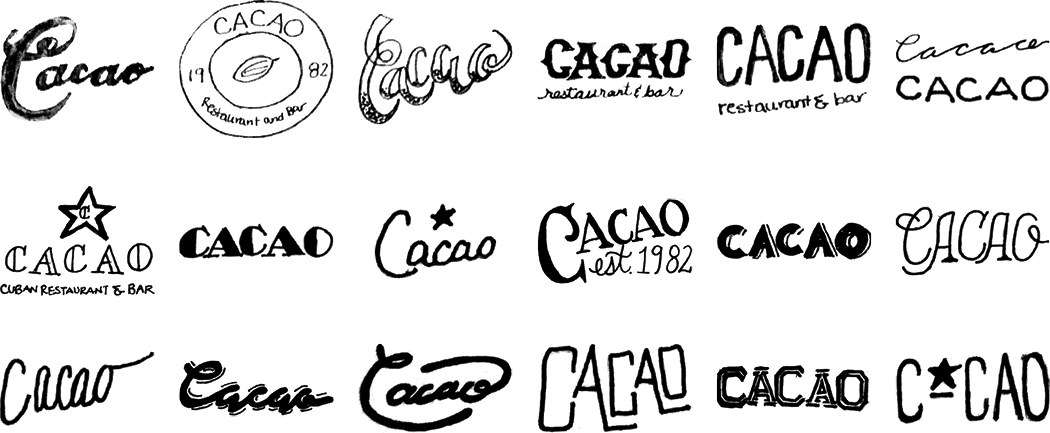
I finally settled on an art-deco-styled wordmark. This direction referenced the style of type used on building signage and vintage travel posters.
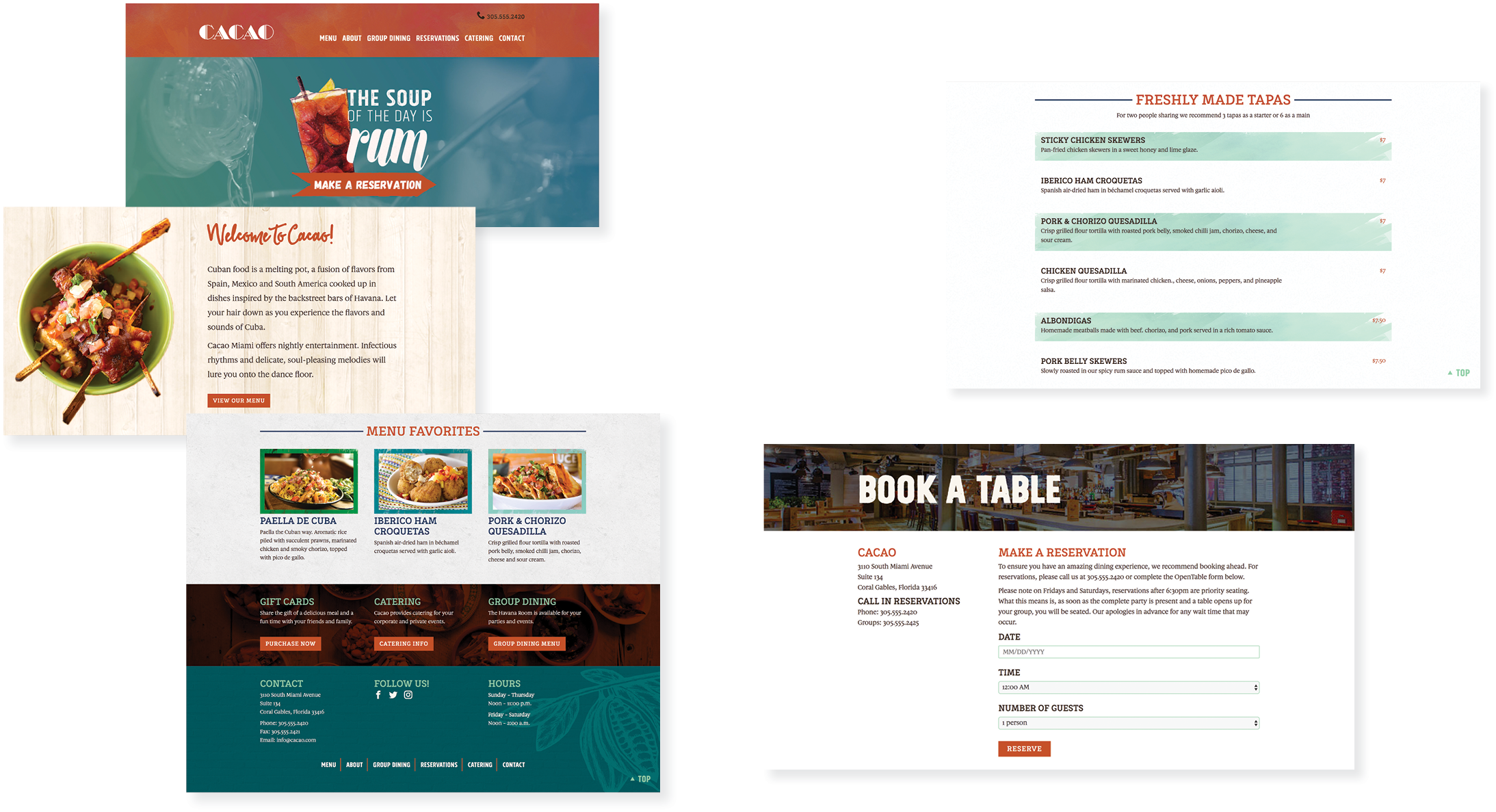
The menu was the primary element that I utilized to guide the look of the brand. My first draft of the menu felt very safe and did not provide enough legs to inspire the remaining pieces of the brand.
I updated the typography, along with the overall appearance of the menu, to create assets that could be carried throughout the entire design.
My initial thought for the menu was to create something very clean with a nod to the Art Deco style, creating an upscale feel. After completing this draft, everything, including my “tile” background and footer, felt too perfected and overworked. It was time to take a step back and reexamine the necessary components to create an authentic Cuban feel.
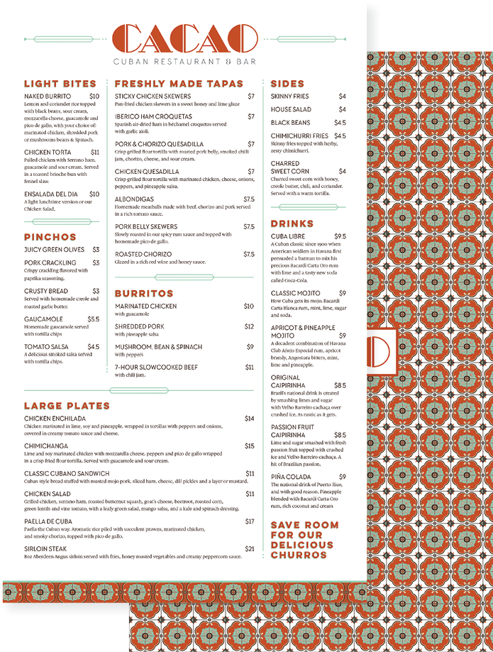
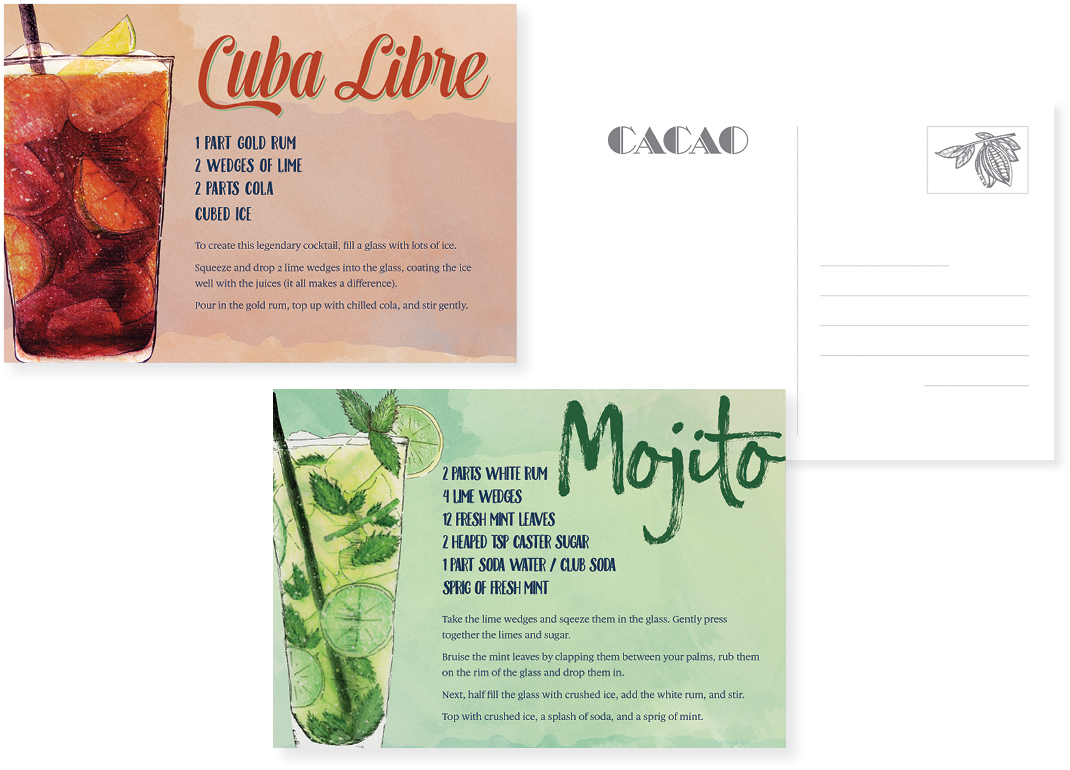
After additional research that explored Latin brands, including non-culinary ones, I moved out of the safe zone. This updated design embraced the use of a variety of typefaces and textures. The newly created assets guided the design to a hand-drawn aesthetic for the brand pieces.
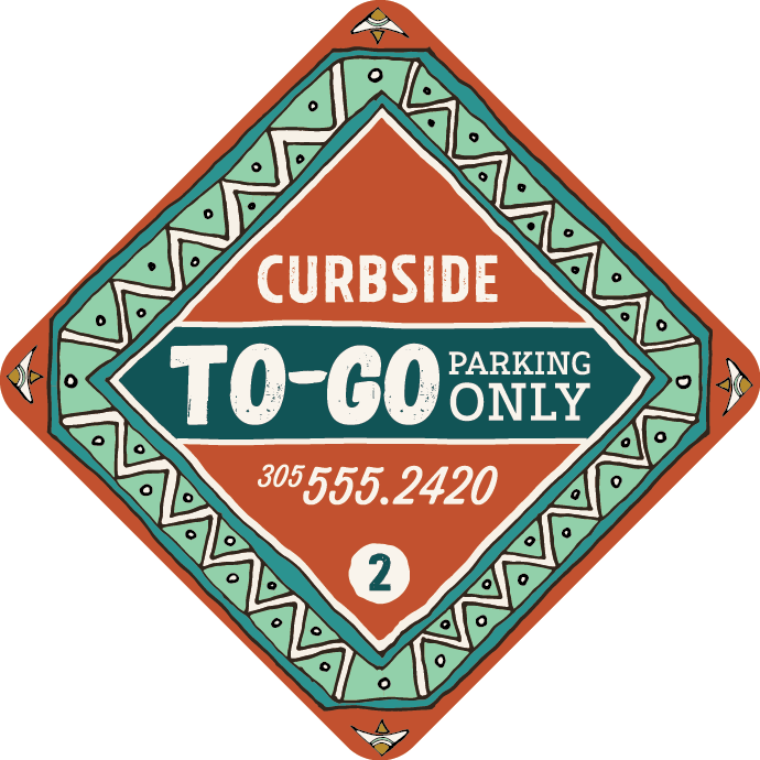
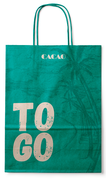
Now that a clear aesthetic was established, it was time to create the remaining elements to tell the story. Every vintage brand that I researched had a very eclectic and gathered quality. I used my updated typefaces, along with a color palette that was extended to tints and shades close to the main colors, to provide the necessary depth. Brand elements were modified as needed to tell the story.
Every brand needs an online presence to attract its audience and set the tone for what users can expect to experience. This site utilizes various elements and illustrations from the print collateral to establish brand continuity. Textures were introduced to add warmth to the site.
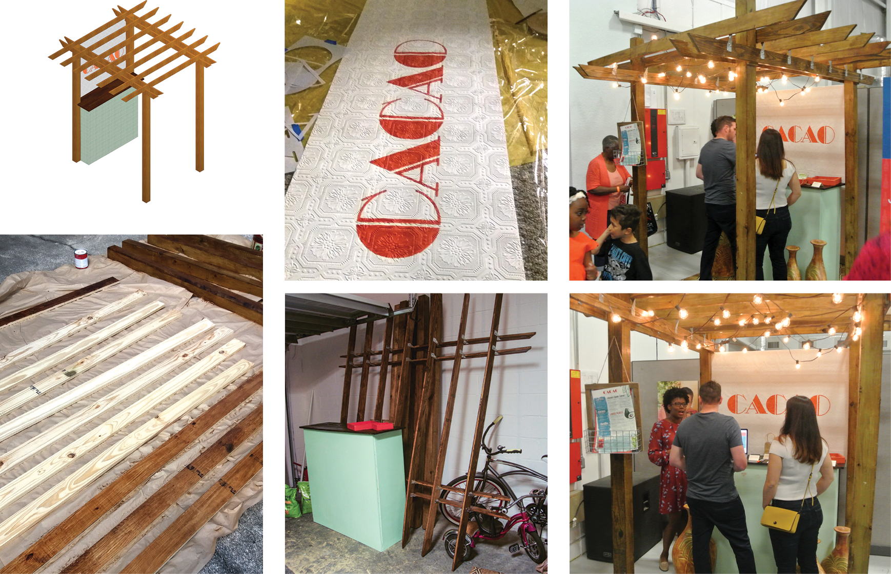
Each year the mentorship program ends with a capstone showcase, called SPOT. Designers present all of their work from the five-month program. My design went through a few changes to make the display more manageable for the build. This design won the Judges’ Best Presentation Award.